Your website design is more important for conversions than you think. You can implement every conversion-boosting tactic in the world, but if your web design looks like crap, it won’t do you much good.
Design is not just something designers do. Design is marketing. Design is your product and how it works. The more I’ve learned about the principles of web design, the better results I’ve gotten.
Here are 8 effective web design principles you should know and follow.
1. Visual Hierarchy
Squeaky wheels get the grease, and prominent visuals get the attention. Visual hierarchy is one of the most important principles behind good web design. It’s the order in which the human eye perceives what it sees.
Exercise. Please rank the circles in the order of importance:

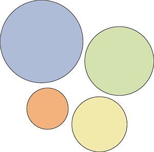
Without knowing anything about these circles, you were able to rank them
easily. That’s a visual hierarchy.
Certain parts of your website are more important than others (forms, calls to action, value proposition, etc.), and you want those to get more attention than the less important parts.
If you website menu has 10 items, are all of them equally important? Where do you want the user to click? Make important links more prominent.
Hierarchy doesn’t come only from size. Amazon makes the “Add to Cart” and “Buy Now” call-to-action buttons more prominent by using color:

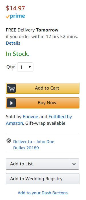 Which buttons catch your eye? Color can help elements of a web page stand out.
Start with the business objective
You should rank elements on your website based on your business objective. If you don’t have a specific goal, you won’t know what to prioritize.
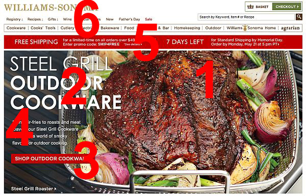
Here’s an example. It’s a screenshot I took from the Williams-Sonoma website. They want to sell outdoor cookware.

 Visual hierarchy is essential to effective web design.
The biggest eye-catcher is the huge piece of meat (make me want it), followed by the headline (say what it is), and a call to action (get it). Fourth place goes to a paragraph of text under the headline; the fifth is the free shipping banner, and the top navigation is last.
This is visual hierarchy—a timeless principle of web design—well done.
Exercise. Surf the web and consciously rank the elements in the visual hierarchy. Then go look at your site. Is something important (i.e. key information that visitors seek) too far down in the hierarchy? Make it more prominent.
2. Divine Proportions

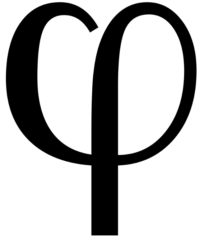 The lower-case Greek letter phi is used for the Golden Ratio.
The Golden Ratio is the magical number 1.618 (φ). Designs that use proportions defined by the golden ratio are, it’s believed, aesthetically pleasing.
Then, there’s the…
Continue reading here


 ‘ + data.settings.title + ” : ” }}} ]]>