
Marketers have access to more data than they need. Your time on this page has already generated data on the pop-ups you close, how fast you read, and where your cursor stops.
To extract value from the numbers in your analytics tools and on your dashboard, you need to organize them.
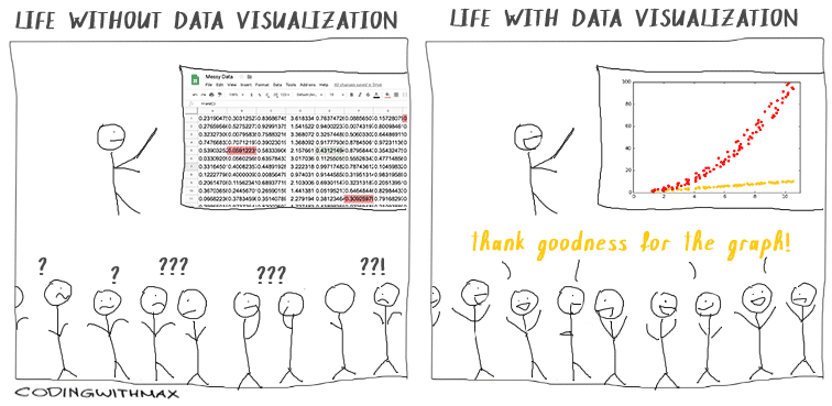
Bar graphs, pie charts, and matrices are data visualization tools that reveal trends and key findings in an understandable and engaging format.
In this article, you’ll learn how to use data visualization to scale your organization through partner networks, sales enablement, and product-led content. We’ll also look at advanced data modeling tools to automate your data representation.
How to use data visualization to accelerate growth
A graph that points up and to the right quickly signals growth. Likewise, large vs. small bars or bubbles help viewers grasp comparisons faster than they can glean them from a spreadsheet of numbers.
How you present information is critical to getting viewers to understand what they’re looking at and getting buy-in, whoever the audience may be.
Marketers use data visuals in two ways:
- Internally. Representing data to stakeholders and team members to understand the market, progress, financials, etc.
- Externally. Demonstrating findings from research or analytics in content.
Whether your audience is a group of internal stakeholders or customers, data visuals can be a powerful tool to accelerate growth. Let’s look at how to do this through three channels: partners, sales, and product.
Collaborate with partners on data
You can use data visuals to create sales enablement presentations and case studies for business partners.
Find data points and analytics that align with your partners’ business goals. Use these to create graphics that address their challenges.
UK-based gym Everyone Active and Weight Watchers (WW) formed a brand partnership in 2021.

WW research revealed that 41% of British people admitted to a weight increase during the 2020 Covid-19 lockdowns, and 65% of those surveyed gained seven pounds or more.
Everyone Active marketers used this information to emphasize the importance of working out on staying healthy, creating a number of marketing materials and promotions that align the brands.
Help sales reps communicate with leads and other departments
When designed as sales enablement assets, data visuals can align sales and marketing teams.
Data visuals make it easy for your sales teams to:
- Help leads with decision-making by showing them how you’ve helped other businesses (or individuals) grow their brand;
- Showcase industry trends through graphs and charts;
- Speak the same language as the marketing team and work towards the same goals.
Coordinate with sales to identify customer concerns. Then collect data for the related metrics and create visuals.
Let’s say your company sells an…


 Your Google ad links to a landing page that encourages users to take action, helping you meet your goals.