A blog can be tricky to get right. There’s a lot of information to display, and you could easily make your website feel cluttered, which negatively impacts your site’s user experience.
Having a poor UX on your site comes with its own set of drawbacks, too, like an increased bounce rate and a drop in search engine rankings. Meanwhile, since there’s a ton of blogs on the internet today, standing out from the crowd is hard enough as it is.
Nevertheless, there’s still a lot of blogs out there that get things right, and that means there’s plenty of design examples that you can follow.
1. Smashing Magazine
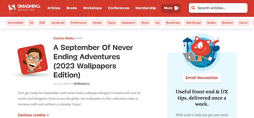
Smashing Magazine uses plenty of whitespace to give its website some breathing room.
The above-the-fold section draws attention to its most recent blog post, which is accompanied by a short description of the post’s contents. Smashing Magazine keeps the same theme below the fold, where it displays numerous other blog posts.
The website aims to generate conversions by encouraging visitors to sign up for its newsletter. The headline and supporting copy on the right summarize the newsletter’s contents and benefits. Meanwhile, the CTA button itself is straightforward and strikes a good balance between attracting attention and not being too obnoxious with its simple white background and red font.
Here’s what Smashing Magazine does right:
- The navigation menu includes a search bar to help visitors find specific blog posts.
- The whitespace above the fold makes the webpage feel less cluttered, preventing visitors from feeling overwhelmed.
- The CTA highlights the contents and benefits of its newsletter right away.